The Geography of Beer
Jakob Johnson and Derek Hunter
December 3, 2018
Process and Work Log
Title: The best beer in the world!
Names: Jakob Johnson ( A01976871, Jakob.Johnson@usu.edu) and Derek Hunter(a01389046, derek.hunter@aggiemail.usu.edu), team nullpointer
Background and Motivation
In 2007, the Brewer’s Association of America consisted of 422 breweries. In 2017, it had grown to nearly 4,000. As the taste of American beer drinkers diversified, simply asking for “a pint of your finest ale, please” was no longer sufficient. Instead, the new craft beer drinkers needed a way to quantify and track which beers they liked and didn’t like. A number of beer rating sites sprang up, and BeerAdvocate rose to the top as the most popular.
I (Jakob) chose this dataset because beer is tasty and interests me greatly. Even though a number of beer review sites exist, none of them are particularly good-looking or have good visualizations of the massive databases they collect and store.
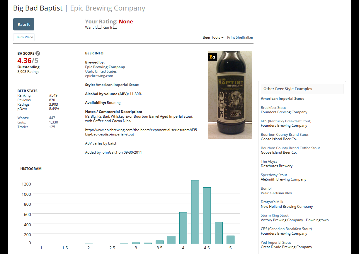
This is an example of a beer’s page, and though it has a review histogram, very little other information is displayed. Link.
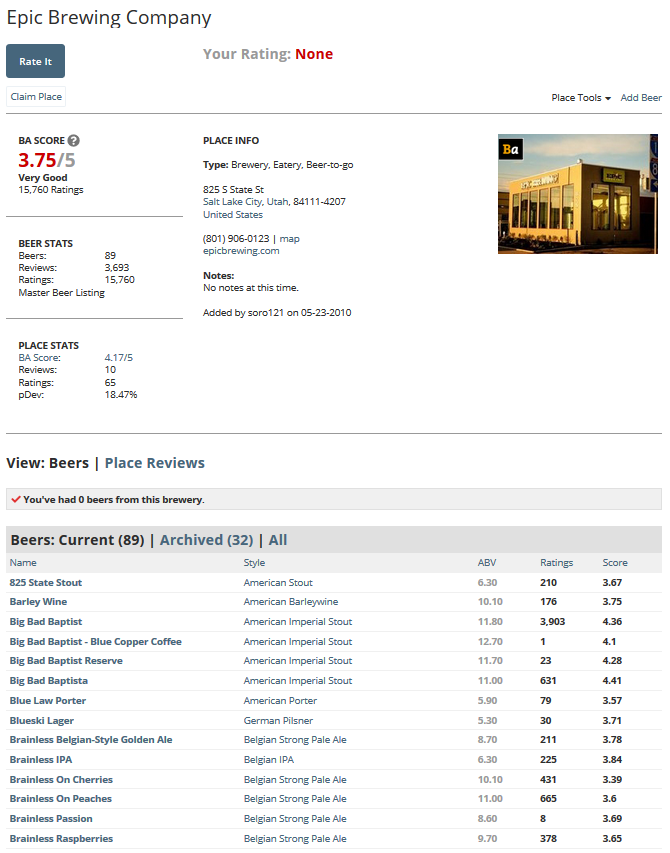
In the overall brewery page, there are no visualizations, only some basic summary stats and a table of beers (that often has duplicates). Link.
Project Objectives
In this project, we want to improve upon the BeerAdvocate platform and better visualize the massive amount of data stored in sites like these. We want to better show the “best beers” in regions and styles, and explore how the rating distribution changes between beer styles.
Data
BeerAdvocate has no public API, but a dataset spanning 2001-2011 with more than 1.5 million reviews was published on data.world. The dataset consists of individual reviews, each with 13 attributes,
brewery_idbrewery_namereview_timereview_overallreview_aromareview_appearancereview_palatereview_tastereview_profilenamebeer_stylebeer_namebeer_abvbeer_beerid
We might also look at including data from RateBeer or Untappd, because they seem to be more open to public data use.
For brewery locations, we will automatically get the lat/long coordinates from Google Maps and store them in the data files.
Data Processing
Processing this massive amount of data will be a challenge. The dataset is fairly large, it had to be split into 4 different .csv files, each around 50 Mb to fit into GitHub. Together these take about 5 sec to simply read into a webpage.
We plan on removing data that are too small to be relevant or useful, such as beers with only one or very few reviews, as well as removing attributes that are not useful such as user IDs.
A significant amount of the data will be pre-processed in R, to allow for quicker load and update times.
Another challenge the data will present is that of location. Since we are only provided with a brewery name, we will either have to manually collect data for the largest/best/most relevant breweries or build in some method of retrieving that data from Google Maps or something.
Visualization Design
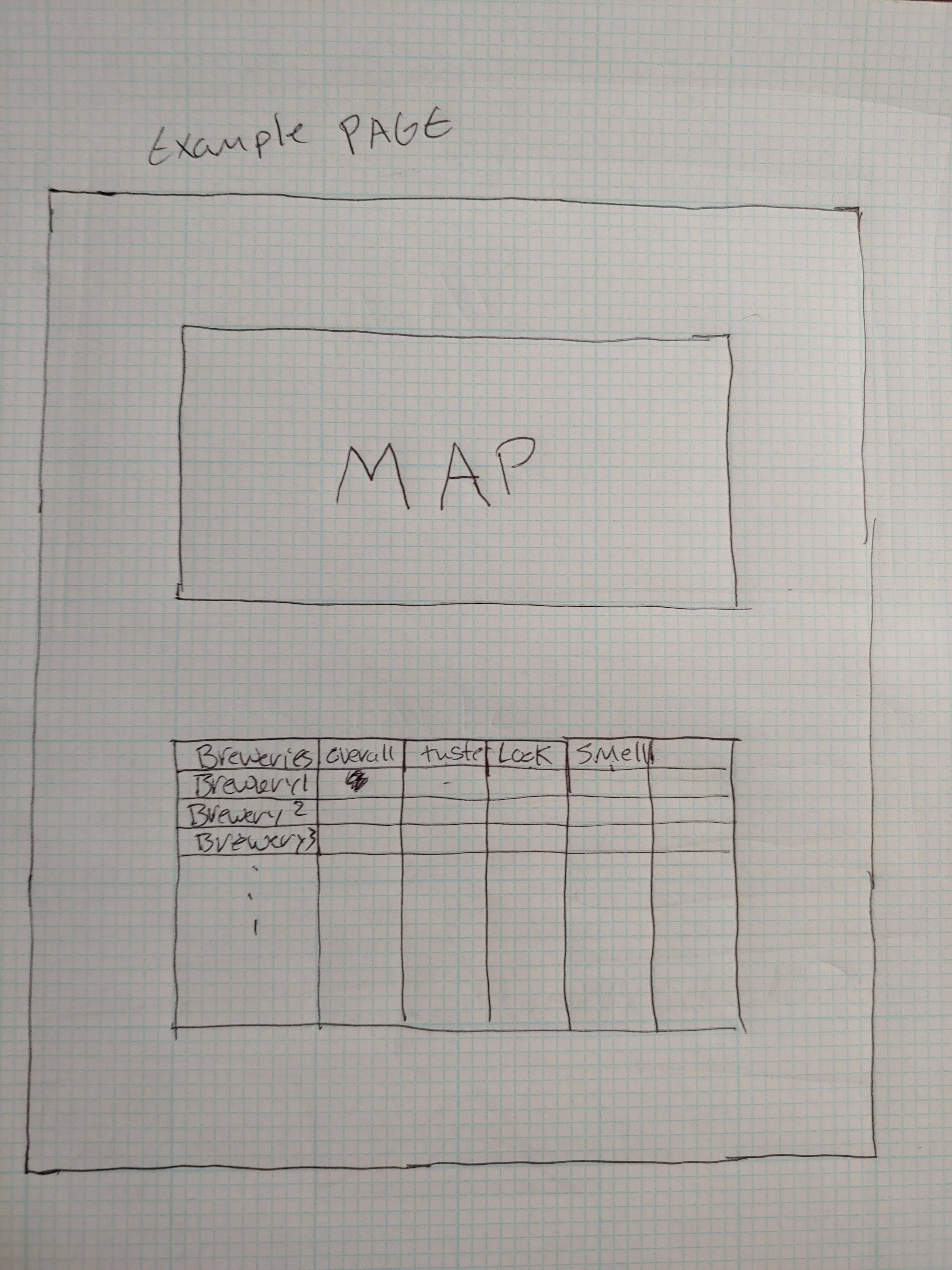
Because of our relatively limited data columns and very large number of rows we’re faced with a couple of challenges for our visulization. We’re mostly interested in inspecting our data by brewery, for example which breweries, on average, have the best beer. Below is an example table idea we had.
Visualizing Brewery Information
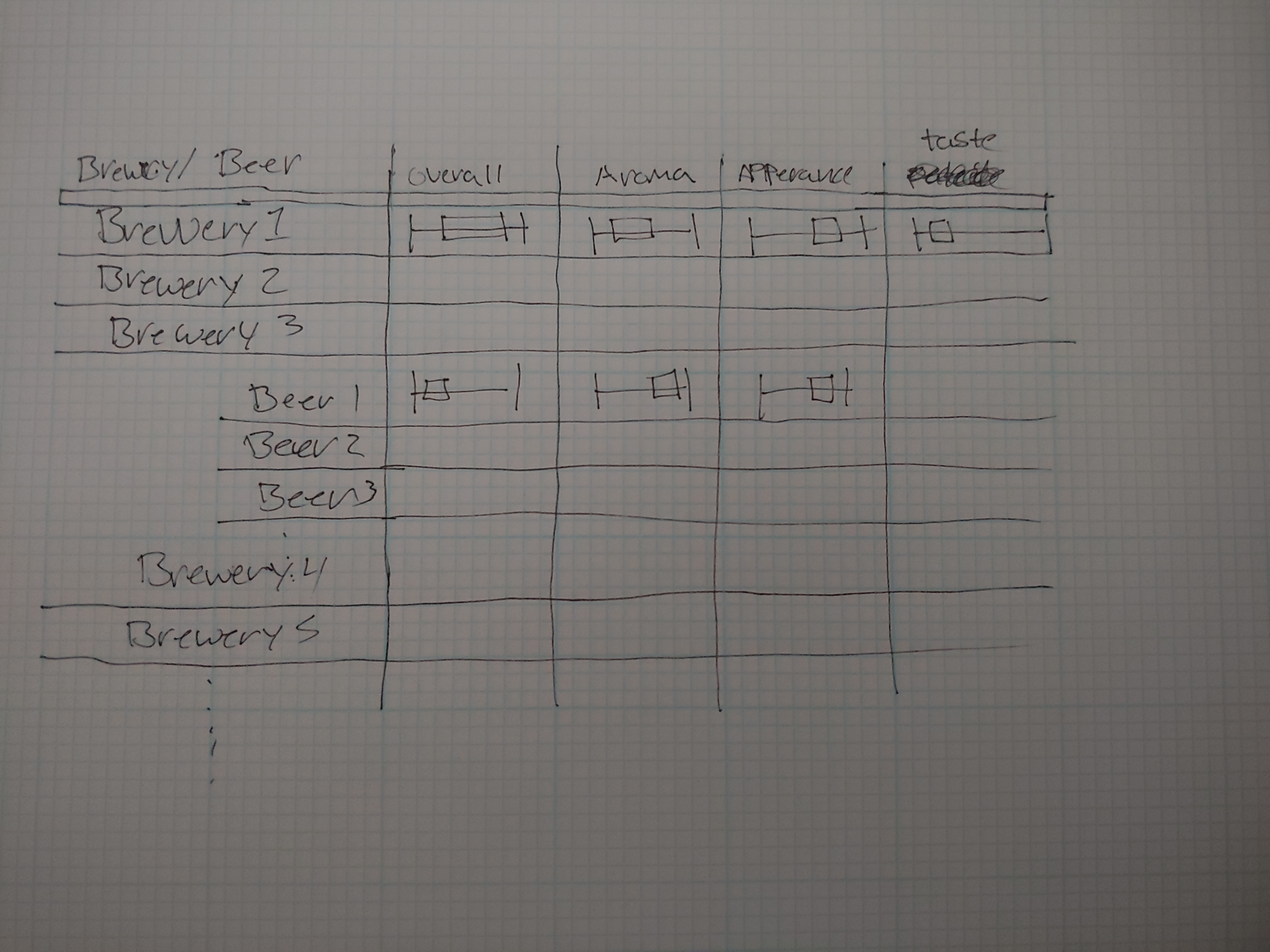
The basic idea is to do something similar to the world cup assignment, where each row in the table represents a brewery, and data cells would be some visualization of the average for that brewery. In the example given above, we used a horizontal boxplot to represent the rating. This could of course be represented by some kind of start system or even just a number. We feel this could end up being a little misleading because we’re throwing out the distributional information contained in the dataset. After then the intended behavior would be a user to click on a brewery of interest and this would add on new rows that would represent each beer that brewery has created. With similar information to the brewery itself.
This method for visualizing the data has a couple issues though. The main one being that we don’t want to create a table with over 5000 rows. We wouldn’t be simplifying the dataset enough. To solve this problem we would like to be able to grab the lat/long of the breweries in the dataset, and draw them on a map. From there the user would be able to add a selection to the map which would filter down the rows in the table to just the breweries selected in the area.
Visualizing Review Timestamp Information
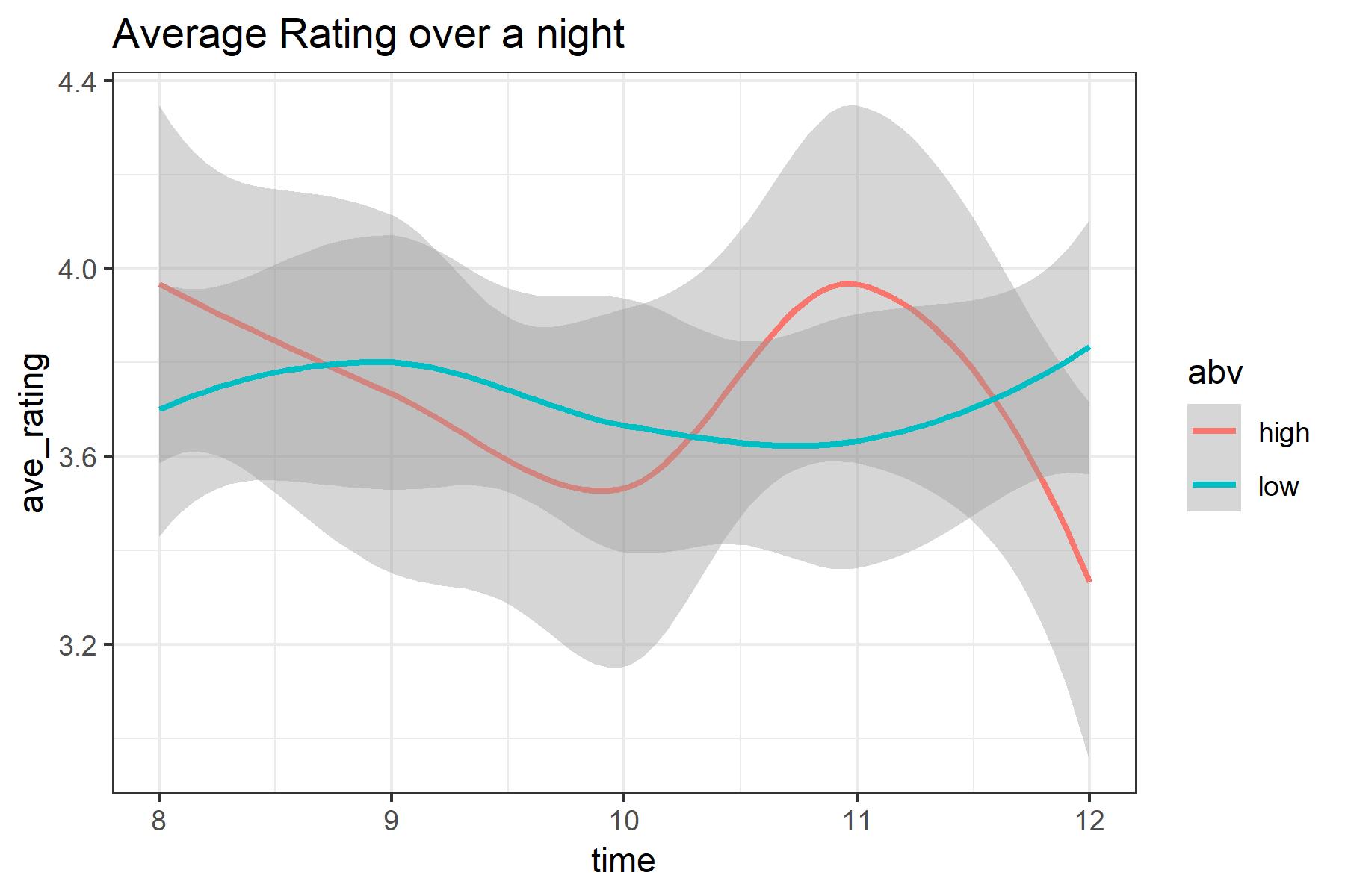
Another idea we had was to look at the timestamps by user, and see if peoples subjective opinions of beer change throughout the night as they drink more. Ultimately however we thought this would be unreasonably difficult to create a visualization for. With the biggest issue being how we aggregate the user data together. Not to mention any inconsistency in the data that we would need to account for. So we ultimately decided against this idea, but we did draft a sample visualization of what that may look like.
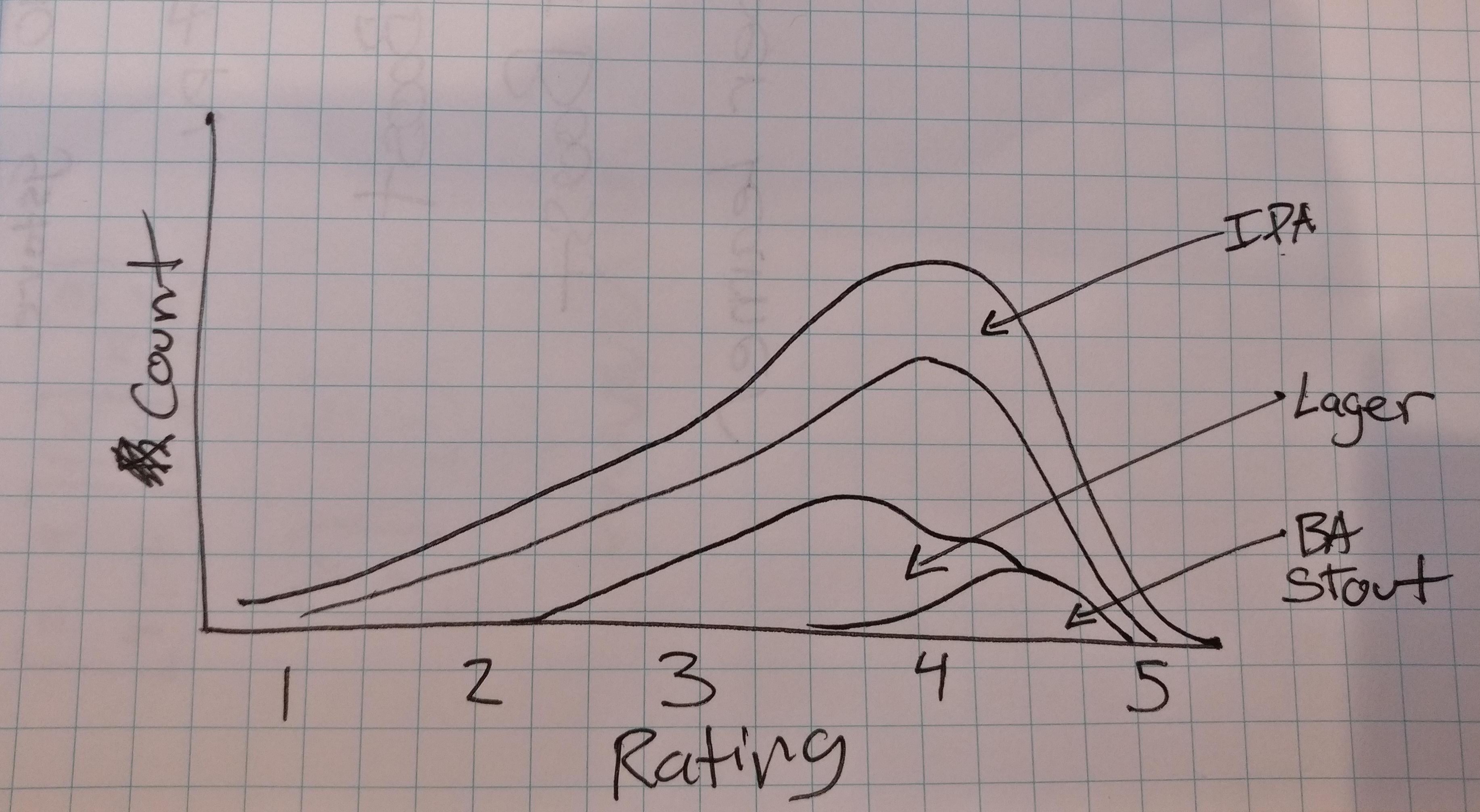
Stacked Distribution
In order to show the rating distribution differences between different beer styles, we could use a stacked histogram or distribution plot. The user would be able to select specific beer styles to compare or display a summary of all ratings.
This kind of plot would be relatively lightweight compared to our other ideas as we could pre-process the data and draw the plot with a small summary dataset.
Proposed Visualization
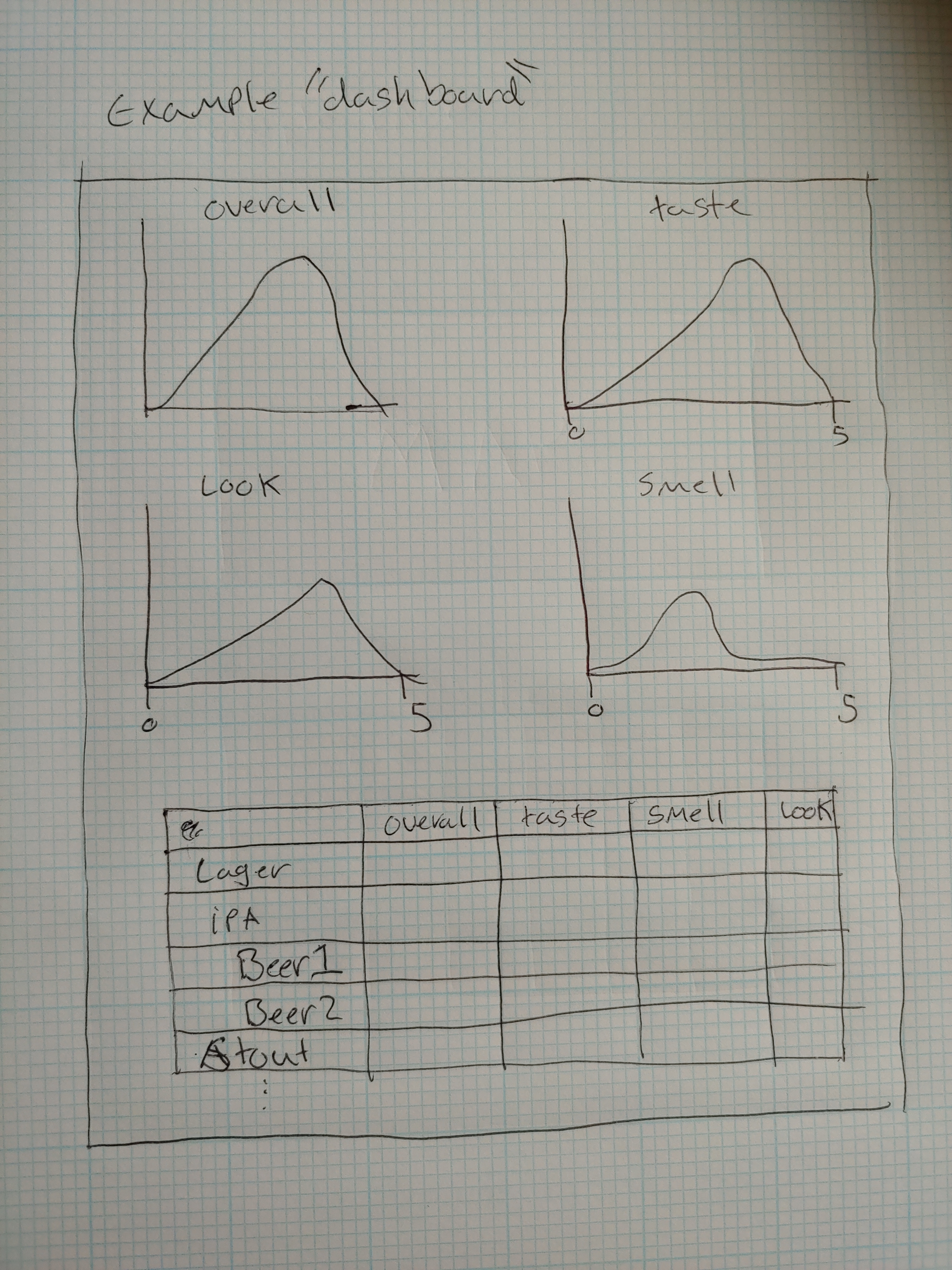
After reviewing our visualization ideas we decided that trying to build something relating to the timestamp information was really not feasible. Our proposed visualization incorporates the idea of the stacked distribution and the fitler-able table into the final design.
The core of the design is of a dig-down style. The envisioned use would be to filter a table of all breweries to ones of interest, for instance breweries near me. Then for the user to select the brewery they’re interested in which would hide the table, and bring up a ‘dashboard’ for the brewery. Which has a list of beers grouped by style, as well as a group a distributions histograms for that brewery, for the 5 interesting review metrics(Overall, Aroma, Appearance, and Taste).
Must-Have Features
A filterable table that summarizes a selection, either of beer style or brewery. We need to be able to look at a subset of the data because trying to plot or build a table of the whole dataset will be prohibitively intensive. So being able to have some kind of filter is necessary.
When a brewery is selected from the table, a “dashboard” of information will be displayed, such as a “top 10” of individual beers, as well as a ratings breakdown by style.
Optional Features
We also need to have some kind of map showing geographic distribution of breweries. This may or may not display every brewery represented in the dataset.
The map will be interactive, allowing brushing to select a subset to display in the table and will contain every brewery. This will be difficult as getting this data requires pulling from Google Maps or some similar map database.
“falling” and “dropping” animations when styles are selected or deselected from the stacked distribution plot.
Project Schedule
- Week 1 (Nov 5-9): Data Pre-processing and Maps Collection, begin table/map implementation.
- Week 2 (Nov 12-16): Rough Table and Map completed, dashboard prototyped with placeholders (Prototype due)
- Week 3 (Nov 19-23): Dashboard implementation, begin design work and cleanup
- Week 4 (Nov 26-30): Final cleanup and animations
Prototype Work Documentation
The first thing we did was load the dataset into R since it was way too big to view in Excel. Accessing it in R first allowed us to look at all the attributes and quickly determine what exactly we were dealing with. The original dataset was one single .csv file that was about 150 Mb in size - too big for GitHub to host - so we split the dataset into 4, 50 Mb files that we could store on GitHub and “bind” together and use as a single dataset for analysis.
After that, we started cleaning up the dataset. The base dataset represented 1586616 different reviews of 56858 beers from 5744 different breweries. A 1.5 million row dataset is too big to reasonably manipulate in JavaScript, let alone load in a timely fashion. To counter this, since we didn’t need to show every review or even every beer at once, we used R to summarize the table by beer, keeping the average ratings for aroma, appearance, palate, taste, and overall score. We also needed to keep track of the beer ID since there may be more than one beer with the same name, as well as count the number of reviews for each beer. We did the same for breweries, keeping the average rating for each of the 5 attributes, counting the number of beers listed, and storing the beers and beer IDs in a JSON structure to be read later on the site.
This still left us with the original 56,000 beers and 5,700 breweries, some of which have very few reviews or beers. To clean up these micro-microbreweries, we removed any beers that had fewer than 5 reviews, and removed any breweries that had fewer than 5 beers (excluding those with <5 reviews). This brought us down to about 1,600 breweries with 21,000 beers.
We still wanted to be able to access individual reviews for each beer and brewery however, so instead of loading the entire dataset at once, we split the dataset into 1,600 .csv files - one for each brewery - to load when the user selects the brewery.
All R code used and process documentation for the project can be seen in R/ba-explore.md.
From here what we generated was a little hard to work with in javascript. The structure was a little hard to work with. So we did some further processing.
The frst thing we were missing was the latitude and longitude data for our selected breweries. We solved this by using Google’s geocoding api and we wrote a python script to go through the list of breweries and grab their location data, and generate a byBrewery-Locations.csv.
Now that we had the location data it was time for some more data cleaning. We wrote another python script that would use the brewery locations data file, and the 1600 brewery review files from earlier, and generate a processed_data.json file.
This file is signifcantly smaller at approximately 10Mb, and we felt was reasonable to load all at once. This file is just an array of brewery objects that look approximately like the following:
{
  "brewery_name": "(512) Brewing Company",
  "brewery_id": "17863",
  "lat": "30.2229723",
  "lng": "-97.7701519",
  "beers": [
    {
      "beer_id": "43535",
      "beer_name": "(512) IPA",
      "beer_abv": "7",
      "beer_style": "American IPA",
      "histogram": {
        "overall": [0, 0, 0, 0, 0],
        "aroma": [0, 0, 0, 0, 0],
        "appearance": [0, 0, 0, 0, 0],
        "palate": [0, 0, 0, 0, 0],
        "taste": [0, 0, 0, 0, 0]
      },
      "n_reviews": 0,
      "averages": {
        "overall": 0,
        "aroma": 0,
        "appearance": 0,
        "palate": 0,
        "taste": 0
      }
    }
  ]
}
This should be our final cleaned dataset. From here we built a very rudimentry table for breweries, as well as for a set of beers for the selected brewery(bottom of the page).
Final Work Documentation
Map - Jakob
My task was to visualize the location of breweries in our dataset, focusing on the United States, even though there are some foreign breweries in our dataset.
In the processed_data file, I have the locations of the breweries but to show them on a map I first found a geoJSON file of the USA, and projected that. Once I had that, it was very simple to add the brewery dots on top.
The next major task was brushing, which was fairly simple to implement, and check which breweries where in the selected area, on the non-zooming map but had to be re-worked later on (we will talk more about this later)
In addition to brushing, I needed a way to visually show which brewery dots were filtered and which weren’t. For this, I used CSS classes and the d3 classed() function which made re-coloring and re-sizing very easy.
Zooming was by far the biggest challenge. I had to zoom both the background map and the brewery dots on a selection, resizing the brewery dots so they didn’t grow too large, and preserve spacial distances. I chose to use two seperate methods for zooming the map and the points. In hindsight, there may have been easier ways, but this led to efficient map-zooming by using svg transformations, and the desired point-scaling effect through x and y scales.
In order to make sure that the entire selection was inside of the viewable window, and in order to not distort the distances in the data, for each selection I calculate a new “view window” that the map will zoom on that accounts for too-wide or too-tall selections. Another problem in this was that of re-zooming and re-filtering. To check if a brewery was in a new selection after zooming required me to un-transform the selection to create a new smaller “view window” and re-check the brewery locations.
After getting feedback from beta testers, I realized that without any sort of city or road mapping, zooming in too far leads to virtually no context to location. This made it very hard to pinpoint breweries in large states or where you may not be super familiar with the local cities. To solve this, I added a collection of cities. I chose cities with populations greater than 200,000 for simplicity. Plotting these dots and names on the map made it look very messy, so I implemented semantic zooming, adding the dots on a low zoom level and city names on a high zoom level. This added spacial context while keeping the look of the map simple.
Another thing I noticed after beta testing was that users wanted to click on the map, and expected things to happen. To add these click events, I had to move the brush element behind the dots, as it covers the entire svg. Click selection was then very easy to implement, as well as brewery name tooltips.
Finally, I cleaned up the visual aspects of the map, recolored the background, state lines, and brewery dots. I added a legend and some help text to let a user more easily understand what is going on and how to navigate the map.
Tables - Derek
My job was to set up the lower half of the visualization; the tables. The functionality we wanted was a sort of drill down behavior. Where a user would filter the brewery table, based on the map selection. From there they could select a brewery of interest, which would then show the the list of beers that particular brewery has created. Then a user could select a beer of interest and the detailed review breakdown. And at each step showing an aggregate summary breakdown of the current selection. For instance, on initial load the detail view would a review breakdown of all breweries. Once filtered, it would update to be an aggregation of just the selected breweries. Once a brewery was selected, it would do the aggregation for the beers that brewery has created, and finally when the user selects a particular beer it would be the review breakdown for that beer.
To do this I started by creating the basic skeleton of the two tables that would populate the brewery table with all of the breweries. Then when a user clicked on a brewery it would populate the beer table. The columns we decided on including for the brewery table was initially brewery name, overall rating, and number of beers. Later we decided to include number of reviews as well. For the beer table, we decided to include the name, overall rating, and number of reviews. Our initial thought was to reuse the table for the breweries, and beers. We felt that this caused a too large of a loss of context to the user. To compensate for both tables being visible at the same time, and the fact that the information is accessible through the summary view we decided to limit the number of columns from our initial design.
Initially we would hide and show the beer table, depending on if a beer was selected. We found this to be a little bit jarring for the user, and later decided to have the column there permanently with a prompt to select a brewery if one was not selected.
The final view that we cared about, was the summary view. We decided to create a smoothed distribution plot for this over a strict histogram. We just thought it looked better. As for the data being fed into this. All of brewery objects, and beer objects had a histogram object, for the 5 review pieces, that we pre-processed in python. For the summary of all brewries, we generated that on the fly in javascript, because it would change based on the current brewery filters.
After I had everything functionally working, I tied in the tables to hooks in the map code, both for updating the map, and updating the tables. The functionality we wanted was, when a user made a selection on the map it would update the brewery table. Then, if a user selected a brewery either, by the table or by clicking on a circle on the map, it would update in the other place, as well as update the beer table, and summary view.
The last piece of functionality we thought was important, was sorting both the brewery table, and beer table. I made it so that a user could sort by any column for that table.
Formatting/About Page - Jakob
While most of the remaining webpage formatting was very basic, this was my first time really building a webpage so most everything was a new experience.
I found some good-looking and simple fonts for the site, Roboto Slab for the headings and titles, Nunito for the map text, and Noto Sans for the body text. These were easy to read and made the page look professional and modern.
The ‘About’ page was fairly simple, but getting CSS rules to work in the way I wanted them was a pain sometimes. I embedded the demo video and added links to the process page and the in-class presentation in pdf form.